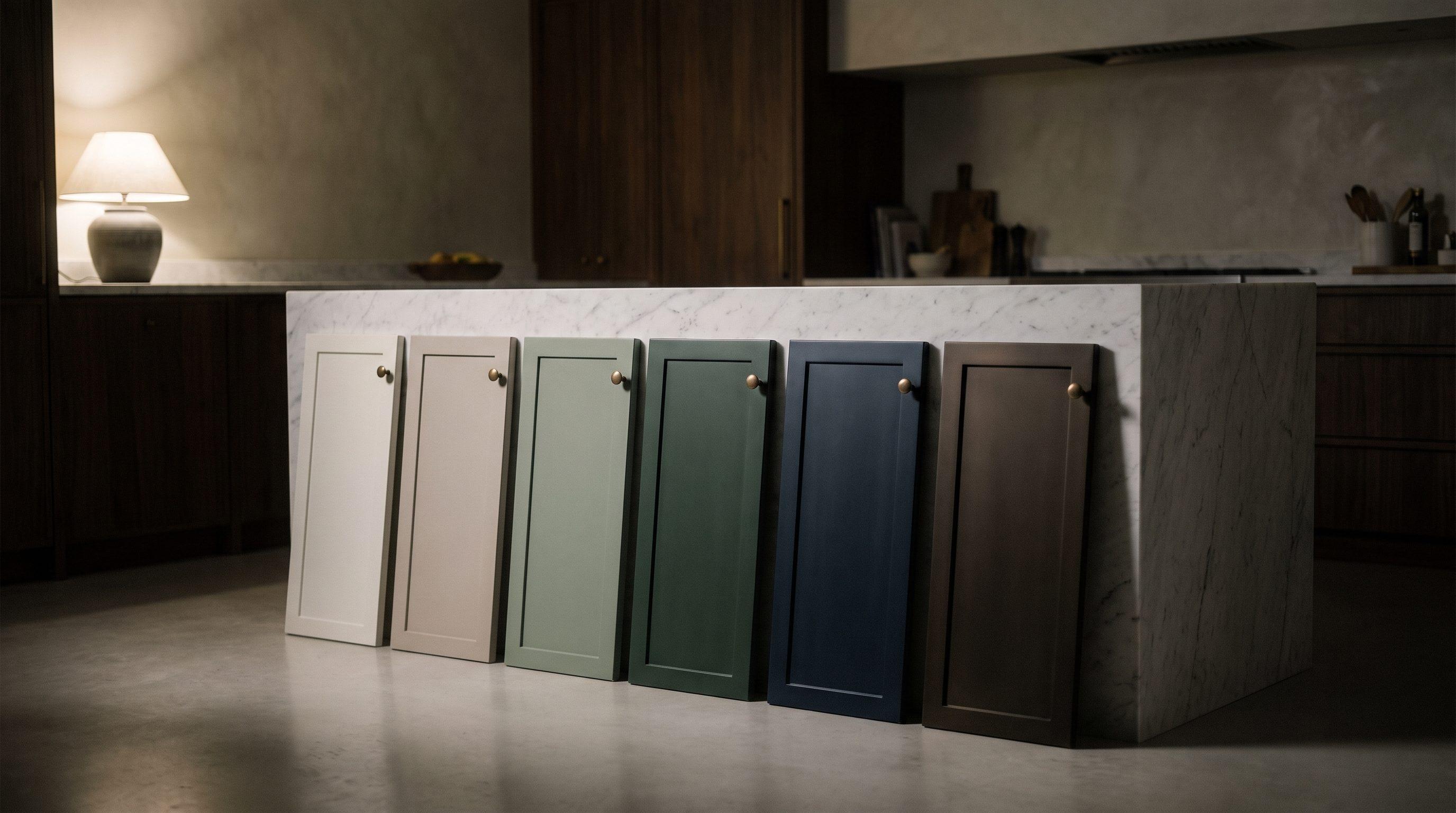
Color guide
Kitchen Cabinet Paint Colors
Our short list, and how to choose.
Choosing a color
The right color depends on your light, your stone, and your floors more than on any trend. These are the colors we'd start with, by family, with the brand and number so you can look them up. And if none of them is quite right, we can mix almost any custom color you want.
Swatches are approximate: no screen shows paint accurately
No. 1
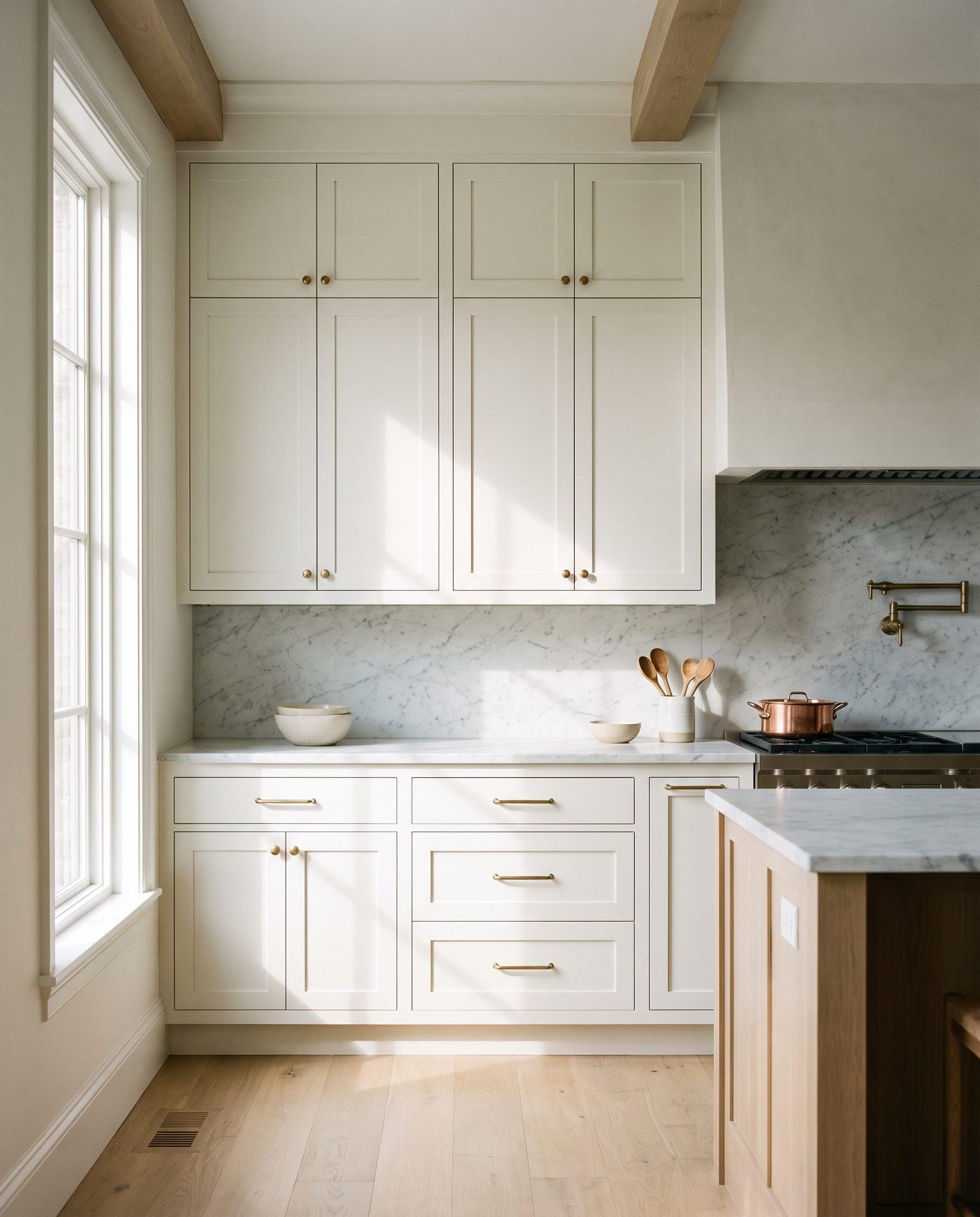
Whites
No white is just white. Each leans warm or cool, and the right one depends on your counters and how much sun the room gets. Warm whites forgive more; crisp ones suit marble and modern kitchens.
White Dove
Benjamin Moore · OC-17
A soft, slightly warm white that works with almost any stone. The safest choice.
Chantilly Lace
Benjamin Moore · OC-65
A clean, bright white with very little undertone. Beautiful with white marble.
Alabaster
Sherwin-Williams · SW 7008
Creamy without looking yellow. Good with warm wood floors.
Pure White
Sherwin-Williams · SW 7005
Balanced, neither warm nor cool. Easy beside stainless appliances.
Swiss Coffee
Benjamin Moore · OC-45
A creamier white for kitchens with travertine, limestone, or warm granite.
No. 2
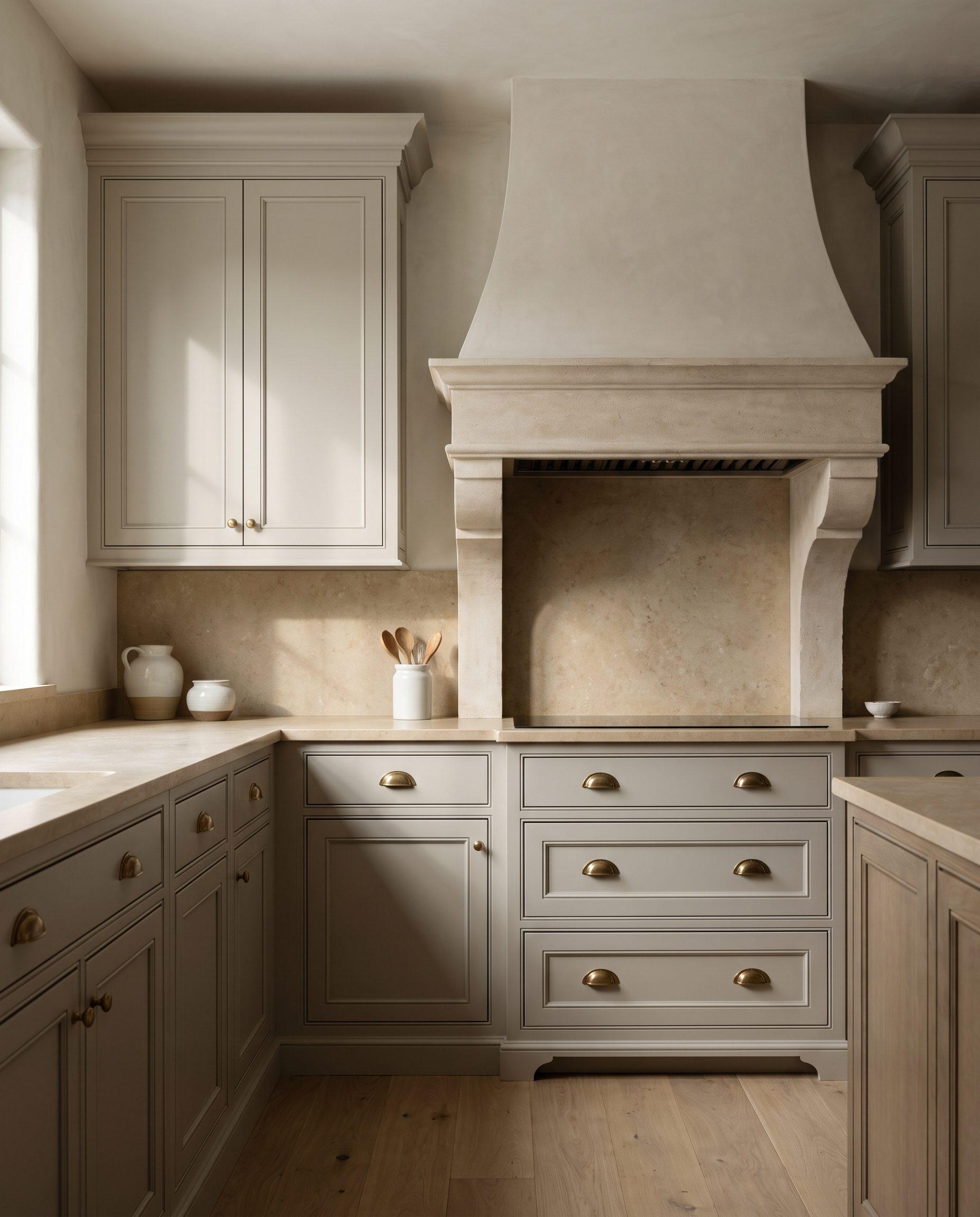
Warm neutrals & greige
Greige, a gray with warmth in it, is the most adaptable cabinet color there is. It hides wear better than white, sits comfortably beside both warm and cool stone, and reads as quietly expensive.
Pale Oak
Benjamin Moore · OC-20
Barely there: a warm, light neutral for a kitchen that's soft rather than white.
Edgecomb Gray
Benjamin Moore · HC-173
A gentle greige that stays warm in shade and doesn't wash out in sun.
Revere Pewter
Benjamin Moore · HC-172
Deeper and more definite. Lovely on raised-panel doors.
Accessible Beige
Sherwin-Williams · SW 7036
A warm, sandy neutral that suits Tuscan-era stone and travertine.
No. 3
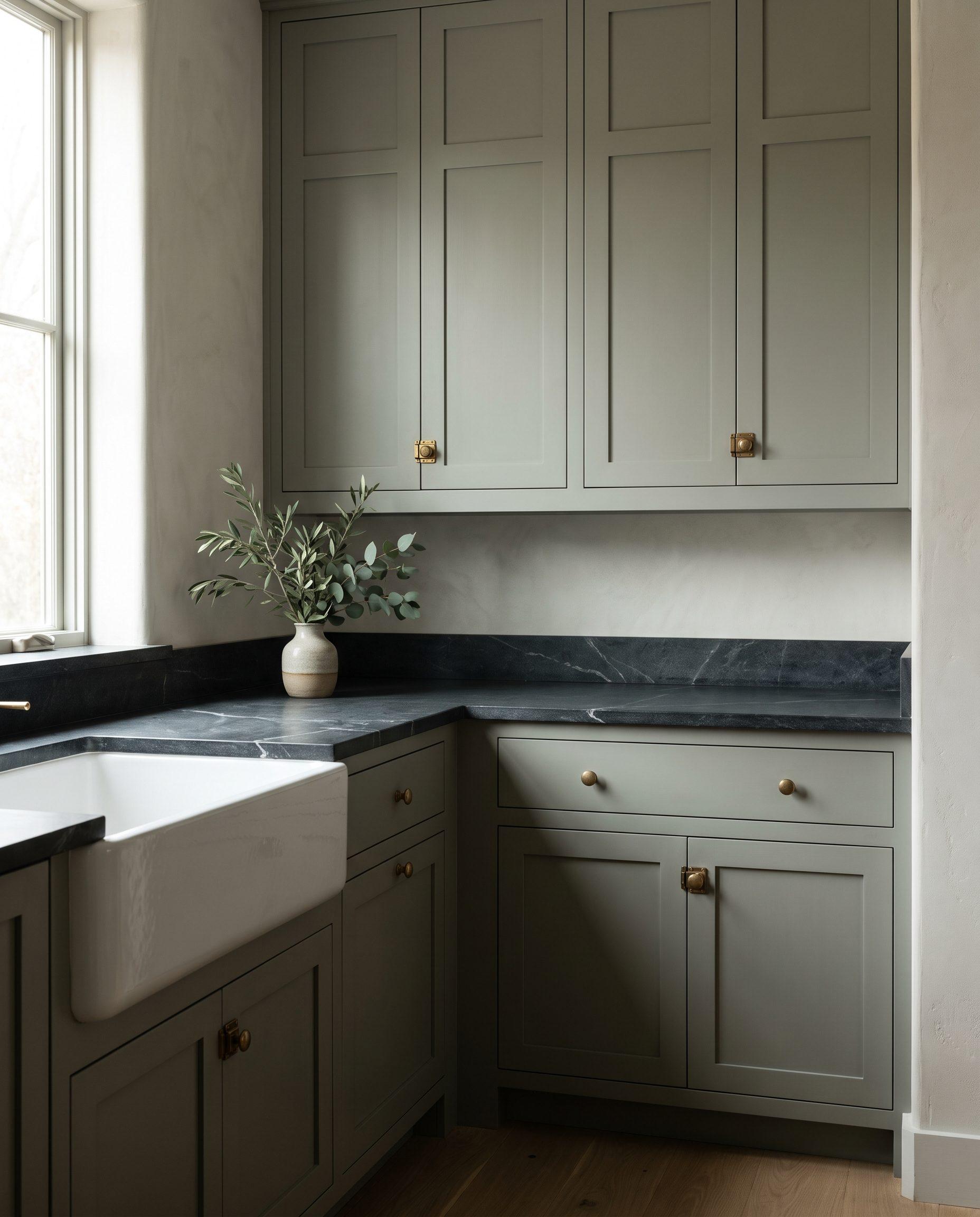
Greens
Green is the color designers reach for most now, from soft sage to near-black forest. Muted greens behave almost like neutrals, and they're beautiful with brass, walnut, and natural stone.
Evergreen Fog
Sherwin-Williams · SW 9130
A gray-green that reads calm and sophisticated in any light.
Saybrook Sage
Benjamin Moore · HC-114
A soft, light sage for a kitchen that feels fresh but not cold.
Card Room Green
Farrow & Ball · No. 79
A muted, earthy mid-green with real depth. Wonderful on an island.
Pewter Green
Sherwin-Williams · SW 6208
A deep, smoky green that pairs with brass and warm wood.
Salamander
Benjamin Moore · 2050-10
Green so deep it's almost black. Dramatic in a bar or library.
No. 4
Blues
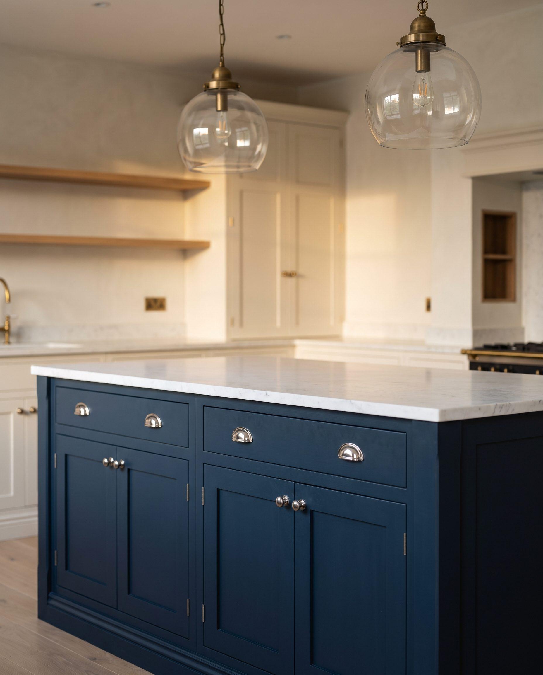
Navy is a classic for islands and two-tone kitchens, and it holds up beautifully in a sunny Texas room. Deeper, inkier blues feel more tailored; brighter ones belong in a powder room or a bar.
Hale Navy
Benjamin Moore · HC-154
The classic island navy: deep, slightly gray, never purple.
Naval
Sherwin-Williams · SW 6244
A rich, saturated navy. Striking with brass or polished nickel.
Hague Blue
Farrow & Ball · No. 30
An inky blue with a hint of green. Moody and tailored.
Stiffkey Blue
Farrow & Ball · No. 281
A vivid, inky blue for a powder room vanity or a wet bar.
No. 5
Charcoal, bronze & black
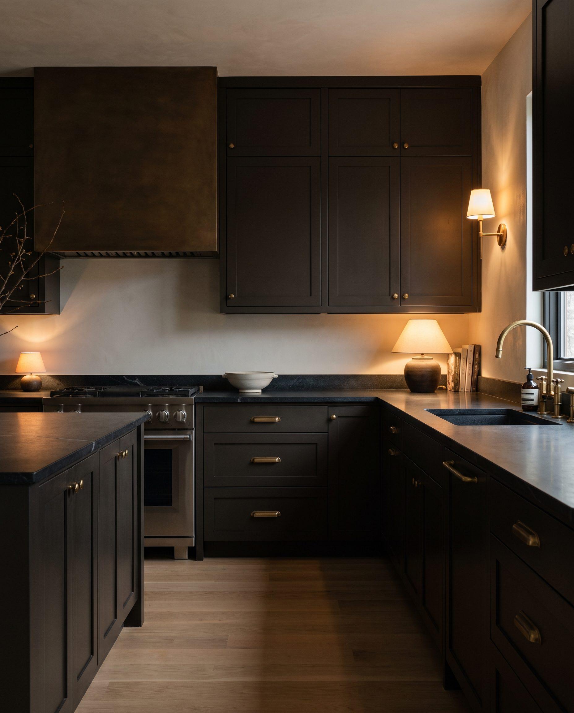
Dark cabinets make a kitchen feel enveloping and architectural. They suit large, bright rooms best, and look richest in a satin sheen with warm metal hardware.
Urbane Bronze
Sherwin-Williams · SW 7048
A warm, brown-black bronze. Softer than black, and easier to live with.
Iron Ore
Sherwin-Williams · SW 7069
A soft charcoal with no harshness. A good first dark kitchen.
Wrought Iron
Benjamin Moore · 2124-10
A gray-black with a little blue. Crisp beside white stone.
Railings
Farrow & Ball · No. 31
A deep blue-black that reads as black until the light hits it.
Tricorn Black
Sherwin-Williams · SW 6258
A true, neutral black for a dramatic, modern kitchen.
Before you choose
How to choose a cabinet color
01
Start with what stays
Your counters, backsplash, and floors aren't changing, so the cabinet color has to work with them. Pull the undertone from the stone, warm or cool, and choose from there.
02
Mind the Texas light
Strong western and southern sun warms every color, and can push a creamy white toward yellow. North-facing kitchens do the opposite, making cool whites look gray. Your bulbs matter too: warm 2700K light and cooler 4000K light change a color more than most people expect.
03
Sheen changes the color
A matte finish reads softer and slightly darker; satin reflects more light and is easier to wipe clean. The same color in two sheens can look like two different colors.
04
Never choose from a chip
A two-inch chip under store lighting tells you very little. We finish a full sample door in your color and sheen and leave it with you, so you see it in your own kitchen, morning and evening, before anything is painted.
Questions
About cabinet colors
Can you mix a custom color?
Yes. Almost any color can be mixed: one matched to a fabric, a stone, or a reference photo, or one adjusted from a color on this list, a little warmer, deeper, or softer. You'll approve it on a sample door before anything is painted.
What's the most popular kitchen cabinet color right now?
Warm whites are still the classic choice, but warm neutrals, muted greens, and deep blues have become just as common, often as a two-tone kitchen with a darker island. The best color for your kitchen depends on your light and your stone more than on any trend.
Can you match a Farrow & Ball color, or any other brand?
Yes. We can match any color from any paint brand in a cabinet-grade coating, and we finish a sample door so you can compare it with the original before work begins.
About color changesDo dark cabinets show more dust and fingerprints?
A little more, especially in a matte finish. A satin sheen, and a deep green or navy rather than a near-black, are more forgiving in a busy kitchen.
Will white cabinets turn yellow over time?
Oil-based paints are known to yellow with age, especially away from daylight, which is why we don't use them. All three of our finishes use coatings chosen for very low yellowing, so whites and pale colors stay true.
Compare our finishesShould the island be a different color?
It's one of the simplest ways to give a kitchen depth. A deeper island against lighter perimeter cabinets works in most open-plan kitchens, as long as the two colors share an undertone.
About two-tone kitchensStill deciding?
The Design Session
Choose your color, door style, and hardware with one of our partner interior designers, with sample doors sprayed for you to keep.
About the Design SessionBegin
See your color on a sample door
We'll see the room, talk through color, finish, and door style, and give you an honest recommendation, then follow with a detailed written proposal.